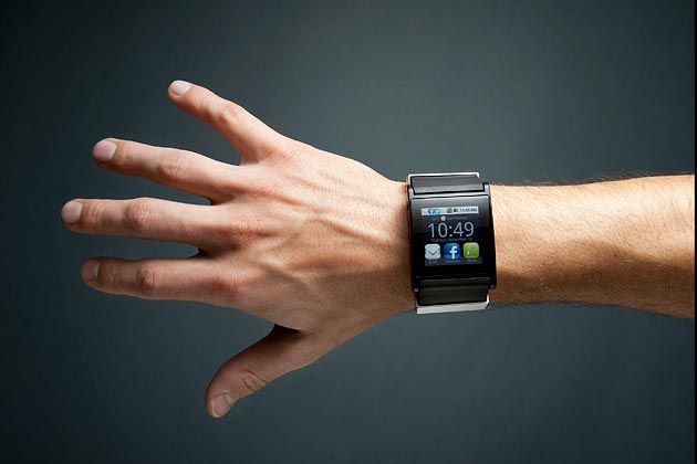
The Apple Watch's UX
Raluca Budiu makes an excellent analysis of Apple Watch’s UI in her article The Apple Watch: User-Experience Appraisal (Norman Nielsen Group). She is very critical with its results, and her opinion can be summarized in the sentence “a watch is not a smaller phone”.
Racula describes how Aple Watch’s apps fail in its design. For example, she says icons are so small that “Launching an app is an adventure”. She also negatively assesses the handoff functionality (refers to allowing users to continue the task started on the watch on their phone) because it “not all apps allow users to continue their tasks on the phone, and, more importantly, the interaction cost of resuming the task is fairly high”. In relation to the content, Racula analyzes how the content of many apps is not an standalone content, this means the content is truncated and cannot be read by itself.
In front these mistakes, Racula makes these four guidelines:
- Distill the essential content that people are interested in and present it in a compressed form that would fit the tiny watch screen.
- Avoid buttons and complex navigation as much as possible, and if you do include buttons make them few and big.
- Use handoff to phone to enable users to get more details and solve problems that require more complicated interactions.
- Create standalone bits of text that can easily be read and comprehended and truly convey the gist of your content.
Enjoy it!
Andreu Sulé
University of Barcelona

